You get all excited to take your new DataSelf Analytics (DSA) for a spin; you open a nice-looking dashboard on your tablet, but… “I can’t figure out what I’m looking at!”
Using DataSelf Analytics is very much like driving a Ferrari… And as you probably know, the first time you drive a Ferrari, you don’t just jump in and drive away with the pedal to the metal!
DataSelf Analytics’ reports and dashboards are designed to be fairly self-informative. However, it takes a bit of time to get a user’s mind spinning in the right direction and subsequently understanding how information is presented. Also, it’s common to find pieces of information that may be unfamiliar to the user.
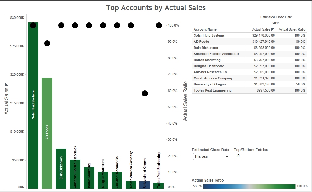
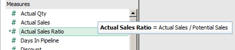
For instance, the dashboard above illustrates the ‘Actual Sales Ratio’ which may be a KPI unknown to the user. However, DSA Power-users can access the tool’s Data panel (via Desktop client or Web’s Edit button), and then hover the mouse over unfamiliar reporting parameters to learn more about just what these KPIs mean (See below).
So, how do I interpret the dashboard above?
- The ‘Top Accounts by Actual Sales’ are shown in a graph and on a grid format (same info, just displayed differently…). Looking closely, one can figure that the size of the bars relate to the ‘Actual Sales’ shown in the left axis, while the black dots relate to the ‘Actual Sales Ratio’ shown in the right axis, with the bar colors relating to the ‘Actual Sales Ratio’. The information illustrates the ‘Estimated Close Date’ = ‘This Year’ and the list includes the top 10 customers by ‘Actual Sales’ this year.
- So how important is the ‘Actual Sales Ratio’ at least as what this dashboard shows? It depends… This dashboard indicates that you’ve pretty much closed all opportunities in the pipeline for your top accounts (ratio = 100% means you closed all opportunities). Yet, one of them bought 40% less than was forecasted in the pipeline… Now it gets interesting…Why so low? What accounted for the reduction in this particular transaction? It may be OK, or it may be an account that needs more attention, but at least now you know!
As you can see, once you get familiar with the basics, flooring the gas pedal can get fun, especially when you have a better understanding of where the curves are!
Happy driving!