Advanced Analytics by DataSelf – Core Financials Edition
Acumatica Dashboards
The following is a subset of the pre-configured reports and dashboards available within the Core Financials Edition.
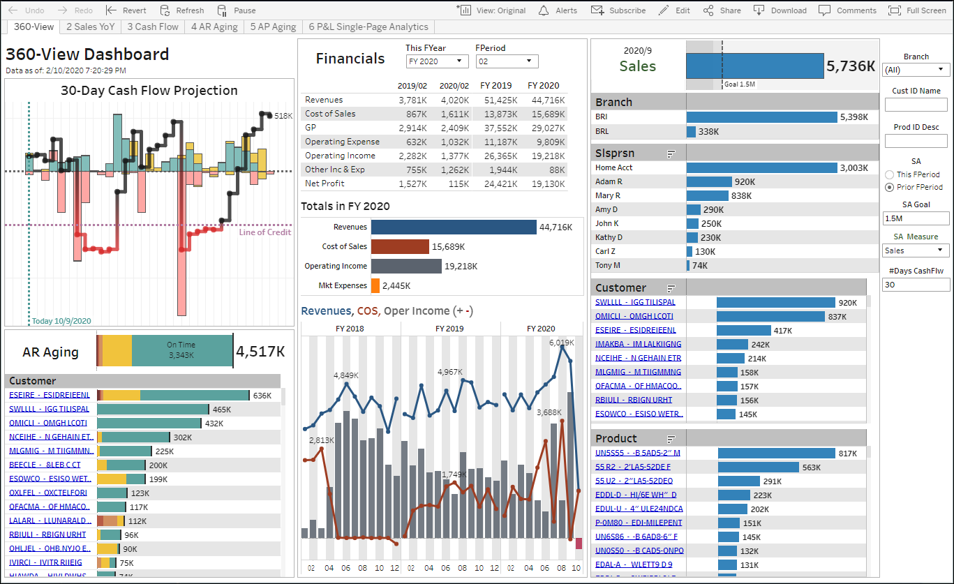
The 360-View Dashboard for Acumatica provides management with a single place to monitor the organization’s main key performance indicators, and easily slice and dice trends to uncover threats and opportunities. From the main page, management can easily drill down into details about their sales, cash flow projection, AR and AP aging. All of this is also available in mobile devices using Android or iOS.
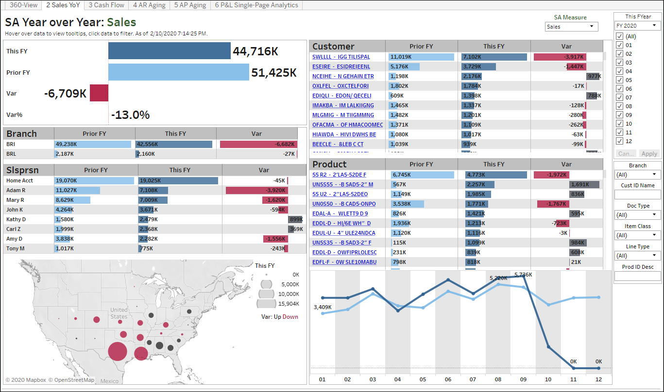
The Year over Year Sales Dashboard for Acumatica provides powerful ways to keep track of critical AR Sales trends. The right panel controls the period being analyzed as well as data filters. The main pane shows totals for This and Prior Year, variances, and the same metrics by branch, salesperson, territory, customer, products and periods. Users can easily sort the tables to uncover top YoY growth or decline, filter the dashboards around data points (for instance, selecting the top 2 products by sales this year will show clients, branches, salesperson, and regions that are driving sales), drilldown in the underlying data, and change the dashboard measure (for instance, analyze profitability or qty sold instead of sales).
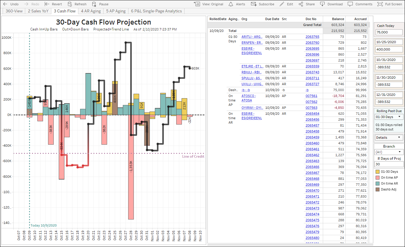
The Cash Flow Projection Dashboard for Acumatica allows management to easily keep an eye on invoices, bills and money transactions (such as cash today, payroll and loan payments – see right panel example below) trends and their impact in cash flow management. Selecting data points on the chart will filter the details on the right panel, for instance, to find out what’s causing the cash flow projection to cross the line of credit Oct 15 on the example below.
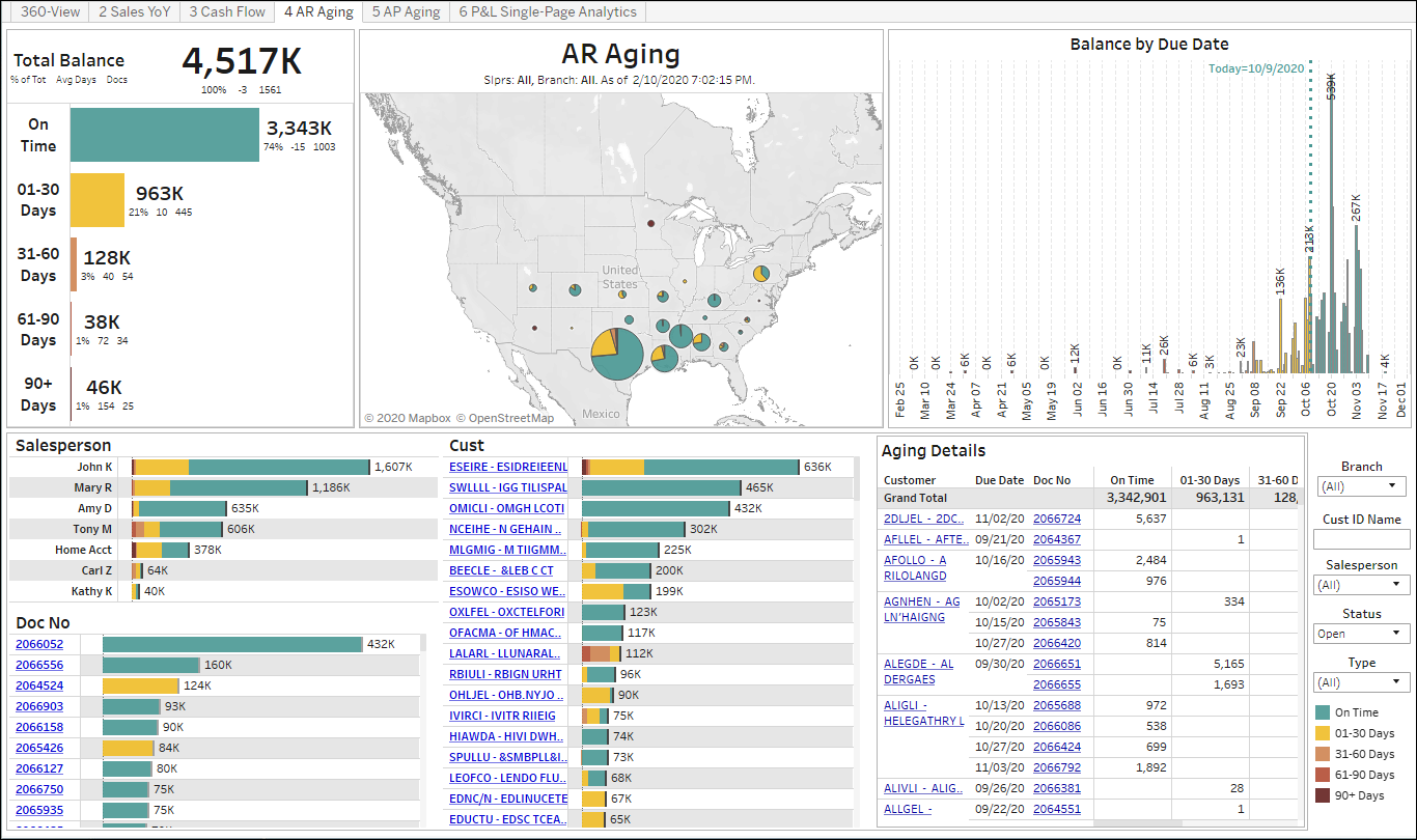
The AR Aging Dashboard for Acumatica provides a clean visual representation of AR Aging totals, aging buckets (color legend), where the money is coming from, distribution by due date, by salesperson, invoice, customer, and all details.
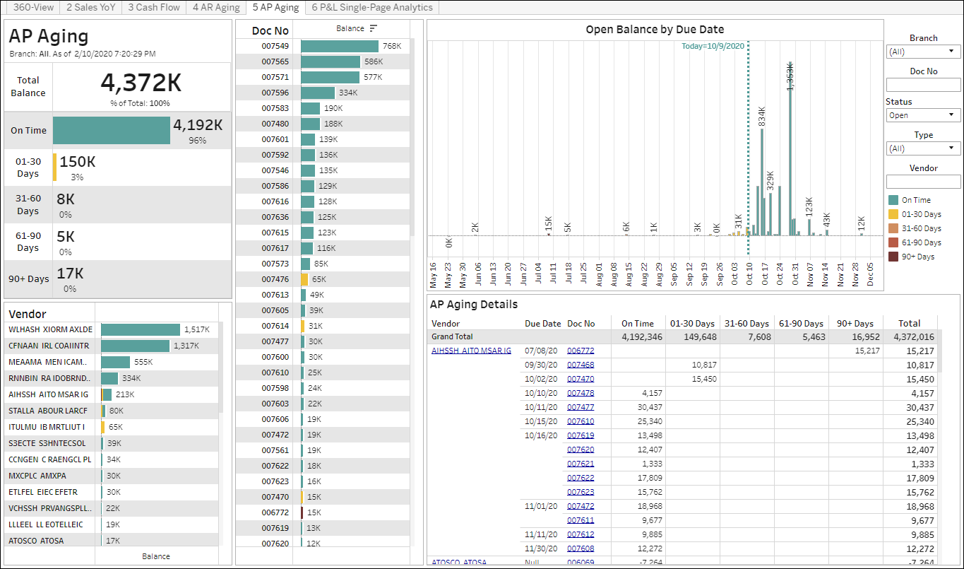
The AP Aging Dashboard for Acumatica provides a clean visual representation of AP Aging totals, aging buckets (color legend), distribution by due date, by salesperson, bills, vendors, and all details.
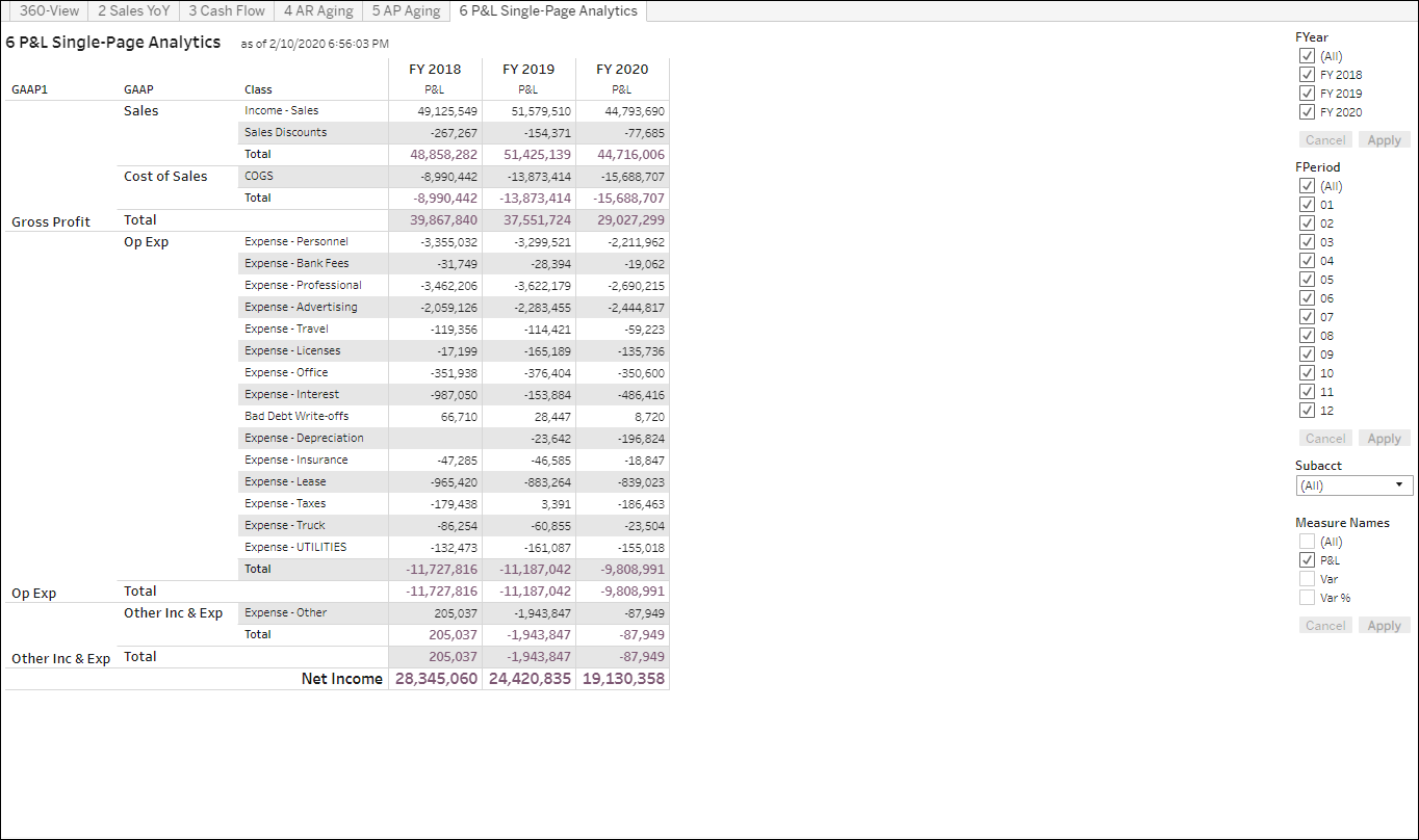
The P&L Single-Page Analytics Dashboard for Acumatica allows users to easily slice and dice their P&L information on a single page. It’s easy to change the periods on the right panel, as well as adding variances. What’s more, users can drilldown into GL accounts, branches, transaction dates, GL batch numbers, and transaction descriptions all within the same page (unlike Acumatica, drilldowns don’t open new web browser tabs). And clicking on a GL batch can open the GL batch’s Acumatica page.
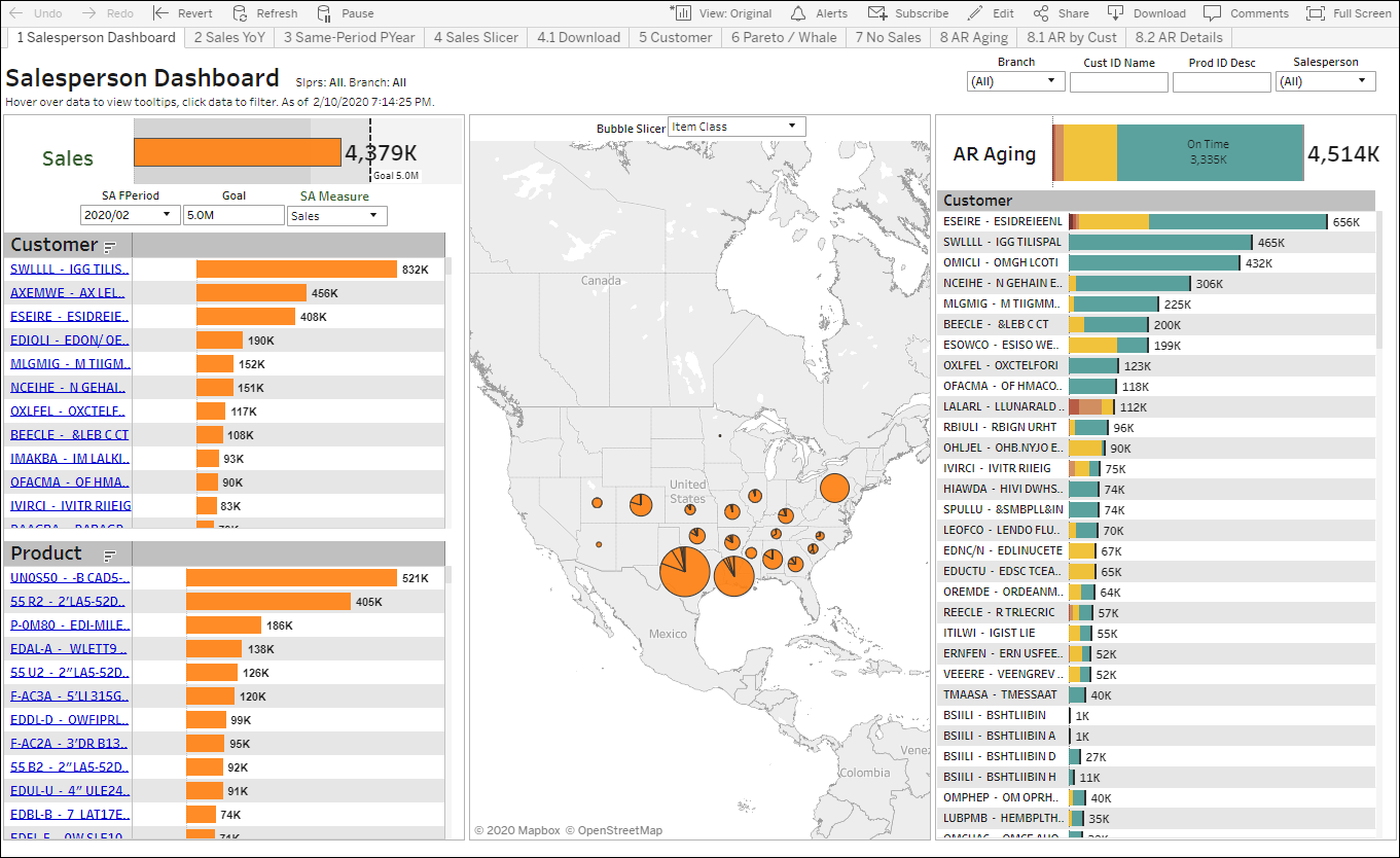
The Salesperson Dashboard for Acumatica lets reps keep track of sales and AR Aging trends. Selecting data points (such as customers) will filter the dashboard, and with another click users can see all underlying data, as well open customers and invoices directly in Acumatica.
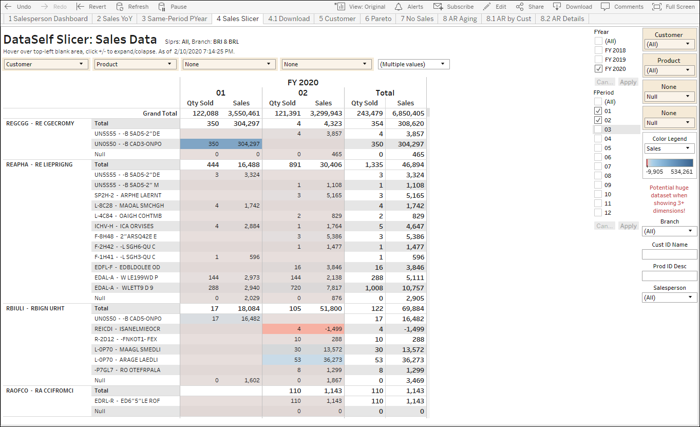
The DataSelf Slicer offers over 1,000,000 ways to slice and dice sales data. Users simply have to select the four dimension slicers (on the top left), the Measures selector (currently Multiple values), and select the filter options on the right panel. Each dimension slicer contains dimensions for Country, State, City, Branch, Cst Location, Customer, Doc No, Doc Type, GL Acct, GL Class, Product, Salesperson, Source, Subacct and Warehouse. The Measure selector provides access to Accrued Sales, Commission, Cost of Sales, Cust Count, Discount, Doc Count, GP, GP%, Number of Records, Prod Count, Qty Sold, Sales, Sales %Tot, Sales Var, Sales Var%. As shown on the example below, this report has the first slicer set to Customers, the 2nd to Product, and the measures set to Qty Sold and Sales. With a few clicks, users can expand the drill down to four levels total and several measures as desired.
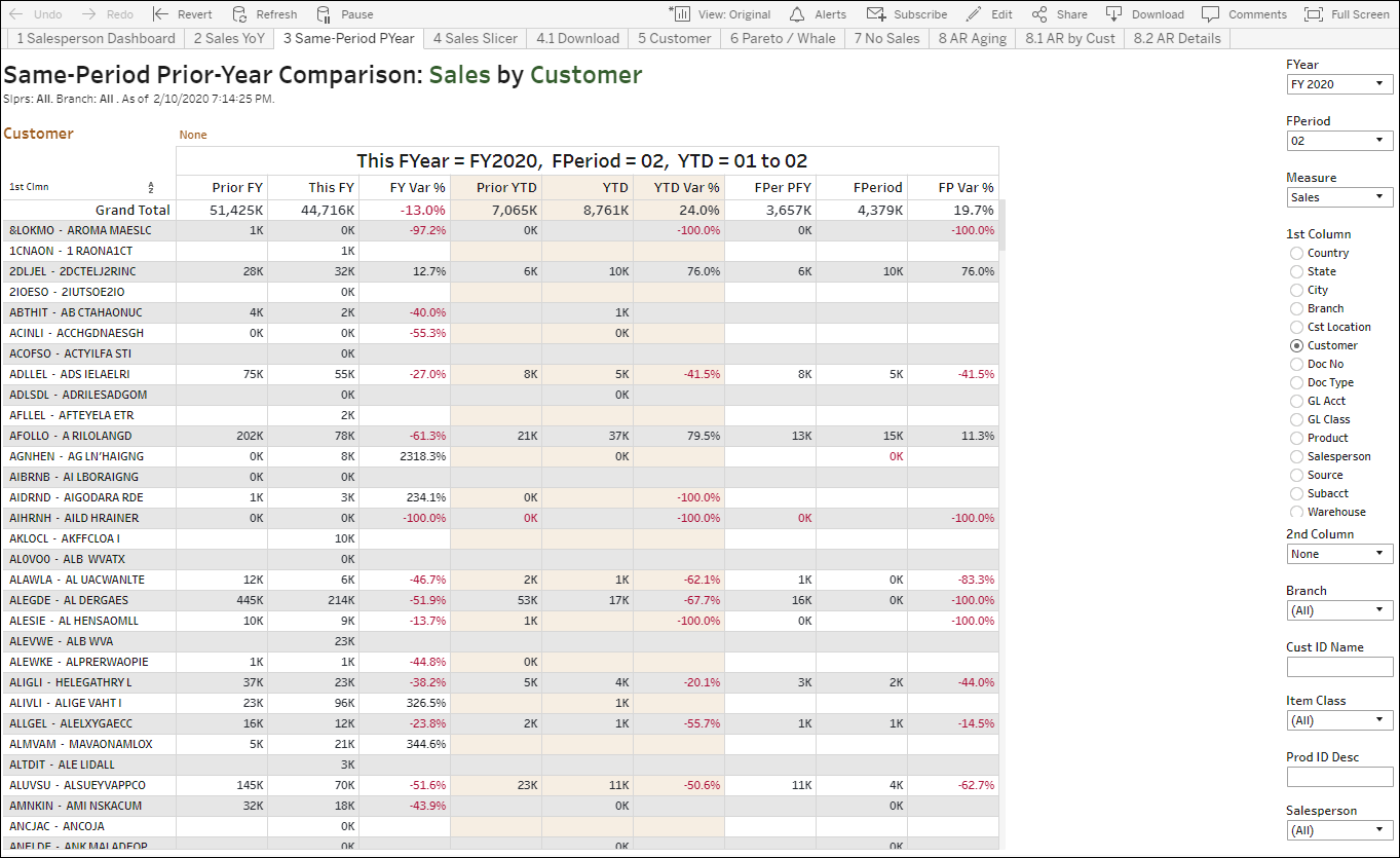
The Same-Period Prior-Year Comparison report provides a simple yet powerful to compare full year, YTD and full period this versus prior year. It’s easy to change the dimension driving the analysis by selecting an option under “1st Column” on the right panel. Users can also drilldown an extra level by using the 2nd Column dropdown list.
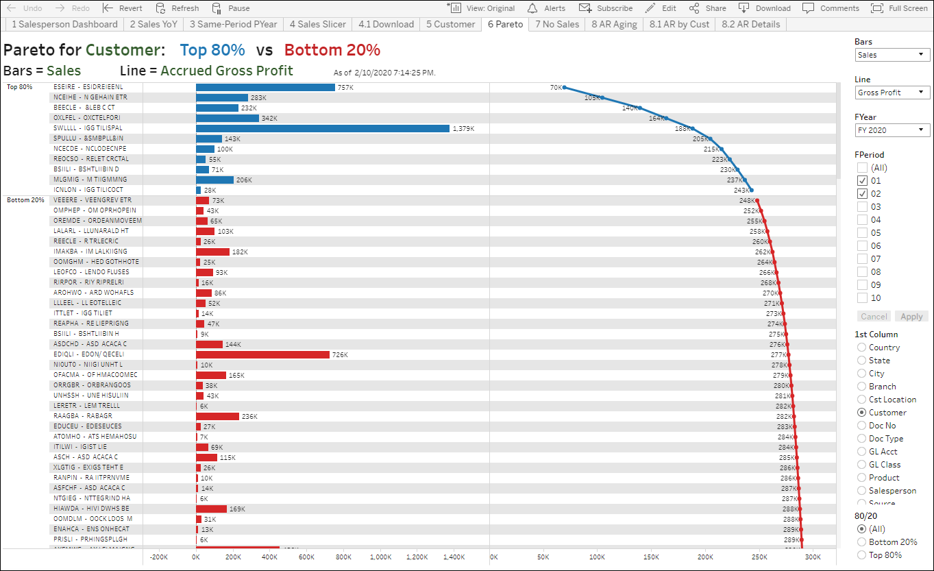
The Pareto Dashboard for Acumatica shows the 80/20 rule against two measures. The top right dropdown lists control what measures are showing for bars and line. The example below shows that small clients by sales provide large contributions to gross profit (top 80% of GP), while many large clients by sales provide little GP contribution. This perspective can be enlightening to uncover clients, products and other dimensions that might be getting too much or too little focus because people don’t understand their impact on the bottom line.
The actual Core Financials Edition comes with some extra reports not listed here.
The preconfigured reports and dashboards are subject to change without notice.
Contact our Acumatica BI Experts!
Fill out the following form and one of our cloud analytics experts will contact you shortly.