DataSelf for Power BI
Microsoft Power BI is a powerful tool for visualizing data—but it’s only as good as the data behind it. That’s where DataSelf comes in.
Key Takeaways
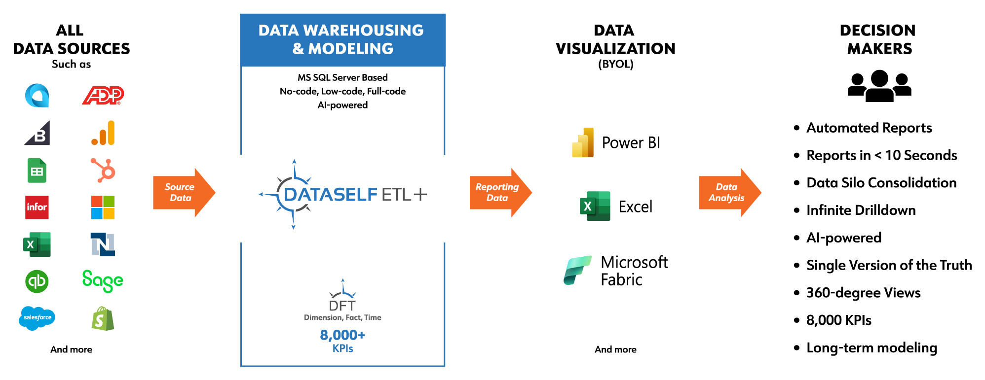
- ETL+ Data Warehousing organizes and optimizes your data before it reaches Power BI to automate and simplify data modeling.
- DFT automates and simplifies data modeling, inclusive of KPIs, reports, and dashboards. This dramatically reduces the amount of time before an organization can deliver sophisticated business insights.
- By offering both on-prem and cloud-based data warehousing, ETL+ ensures scalable, secure, and high-performance data storage for Power BI.
DataSelf Modules in Power BI
- AP Aging Today
- AR Aging Today
- Cash Flow Projections
- Inventory On Hand History
- Inventory On Hand Today
- Inventory Projections
- Inventory Transactions
- Purchase Order
- Sales Invoice
- Sales Order
The DataSelf Difference for Power BI
By optimizing and organizing your data before it reaches Power BI, DataSelf unlocks faster, more reliable insights without the usual headaches. Our automated data modeling, simplified deployment, and built-in Business Glossary empower both technical and non-technical users to build better reports—faster.
All of these capabilities are now delivered through a unified Power BI Semantic Model, which further simplifies deployment and usage. This unified model directly addresses the most common Power BI pain points:
- Slow refresh times and refresh failures
- Inconsistent KPIs across reports (no “single version of the truth”)
- Difficulty aligning with BI governance policies (such as GDPR and HIPAA)
- Frustration connecting to and blending data from multiple silos
With DataSelf, Power BI becomes faster, smarter, and dramatically easier to use. Here’s how.
The Benefit of ETL+
ETL+ Data Warehousing supercharges Power BI by optimizing the data within the applications (and other datasets). ETL+ does this by (e)xtracting your source data, (t)ransforming it, and (l)oading it into a secure SQL Server data warehouse.
In order to optimize data for Power BI, ETL+ automates the data modeling process using our DFT+ (Dimension, Fact, and Time (DFT) module). This enables Power BI users to improve performance, simplicity, scalability and compatibility within their business systems.
- Dimension refers to a constant data element and/or descriptive attribute, including customer names, product categories, branch, or dates of sale.
- Fact refers to a measurable value – such as order total, sales invoice amounts, purchase orders or gross profit.
- And Time refers to the amount of time over which the “facts” are presented.
The DFT module enables measurements like:
- Average Sales Per Item this Year
- Gross Profit
- Sales this Year
- Sales Growth
- Items Sold Last Year
- Customer Growth
- Average Sales Per Customer This Year
- PO Order Quantity
The Result > A Unified Power BI Model
Thanks to cleaner, reorganized data and thousands of pre-built KPIs, even non-technical users can easily create and customize reports in Power BI—eliminating the need to rely on data analysts for every request.
This is made possible by a unified Power BI model that simplifies deployment without requiring programming knowledge, SQL installation, or technical expertise. After the initial ETL process pulls in all source data, subsequent updates are quick and efficient – capturing only new or modified records to keep everything running smoothly.
We’ve also added a Business Glossary to help users better understand the data behind the reports. Think of it as a user guide that explains what each table, column, and calculation contain – so even non-technical team members can feel confident exploring and building with Power BI.
Whether you’re new to Power BI or already a pro, this model helps everyone quickly get on the same page.
Multi-Tiered Security in Power BI
By combining Power BI with ETL+, you can take advantage of a multi-tiered security approach:
- Row-Level Security (RLS): This restricts data access at the record (or “row”) level based on user roles. This is customizable to fit customer-specific needs.
- Object-Level Security (OLS): This restricts data access to specific tables or columns to protect sensitive information from unauthorized users.
- Workspace Security: This allows users to define user roles (i.e., Admin, Member, Contributor, Viewer) within Power BI to control access and collaboration.
- Data Source Security: This allows users to secure the connections to underlying data sources, using encryption credentials for protection.
- Cloud-Native Security: This incorporates the Azure Active Directory (AAD) for authentication and Single Sign-On (SSO).
Are you ready to see if DataSelf + Power BI is right for you? Contact us today!