![]()
The following is a sample from over 1,300 Tableau report, dashboard and KPI templates for analyzing invoiced sales, quantity sold cost of sales, gross profit and returns by customer, acct manager, product, customer address, ship to, location/warehouse, and several other dimensions. Please contact us to discuss other templates you might be interested in.
Power BI Sales Templates: click here.
SA Sales – Sample Dashboards
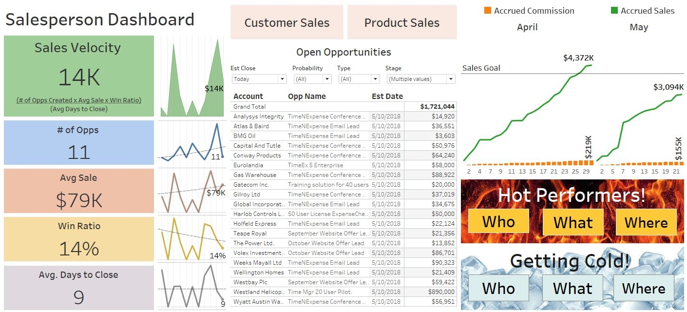
Salesperson Dashboard
- Left side with key metrics that each salesperson is responsible for. The screenshot shows sales velocity, but it can be easily customized.
- The center shows tasks to work on: detail opportunities or other activities like pending quotes. The top has buttons to access detailed customers and products analysis.
- Top right shows accrued commission and sales by month & day.
- Bottom right provides access to additional pages to analyze hot and cold performers! Who’s hot? What products are hot? Where is hot (country/state/city)? On the other hand, which customers, products and regions are getting cold?
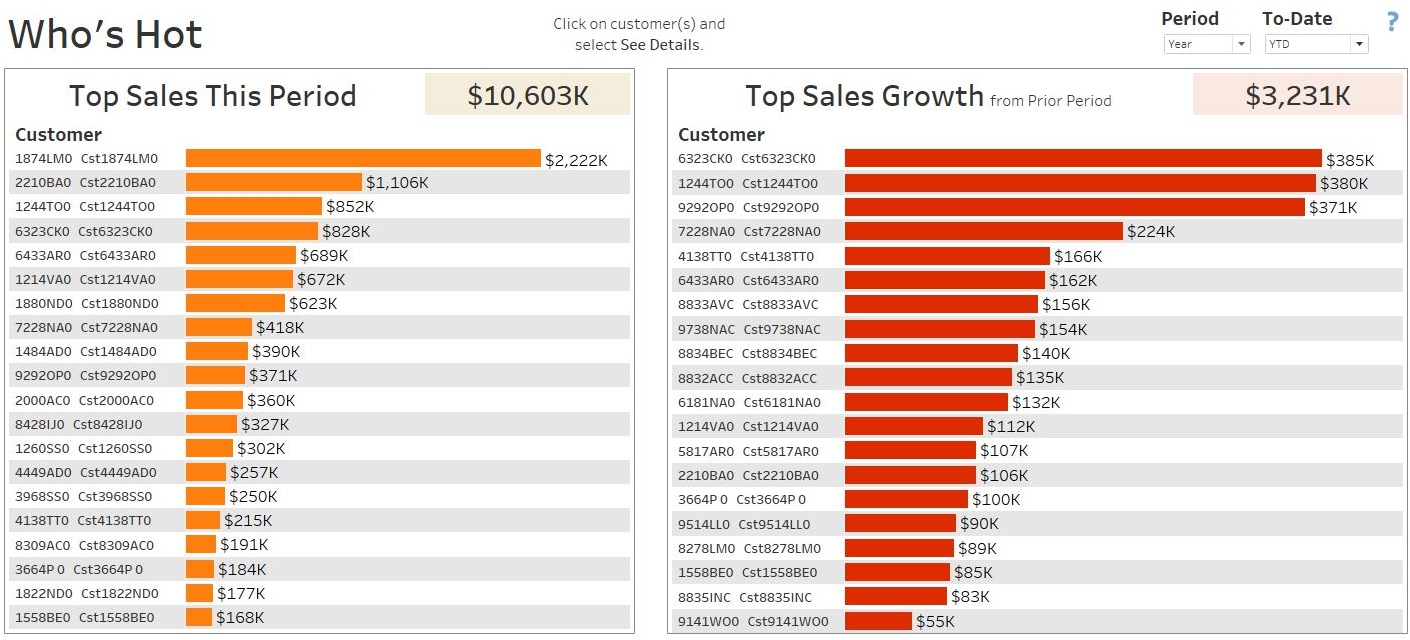
The following is one of the Salesperson Dashboard pages to analyze who’s hot. The out-of-the-box dashboard defines “who’s hot” as customers with top sales this period, and customers with top sales growth since prior period. Periods are defined by the drop-down list on the top right.
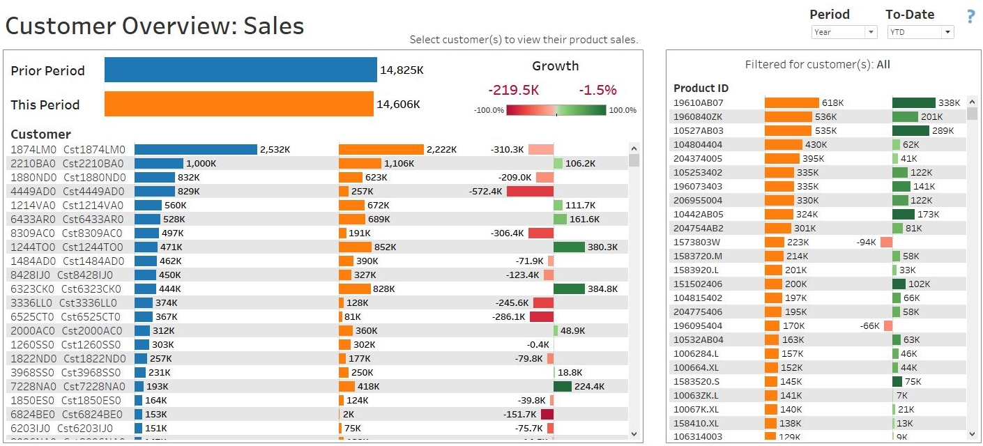
Customer Overview
The Customer Overview dashboard contains more than a dozens ways to analyze customer trends. The page below lists all customers and their total sales in the last two periods, selecting customers will show their products sold, including drill down to detailed invoice information.
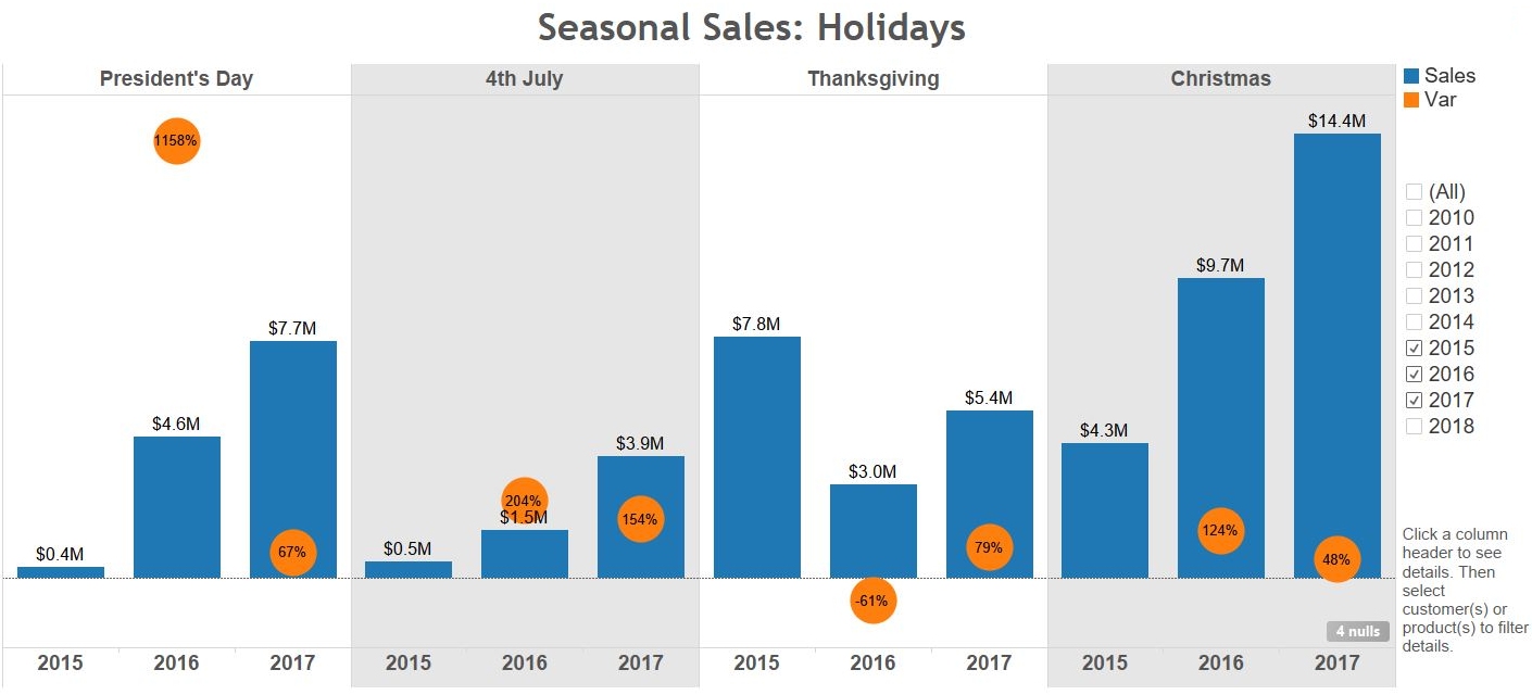
Seasonal Analysis
Most businesses are influenced by seasonality. The templates include dashboards to analyze around holiday periods, 4 seasons (winter, summer, etc), YTD, monthly, combined months, and ad hoc date ranges. Clicking on a season column will drill down to show customers and products that are driving sales and sales growth and declines year-over-year.
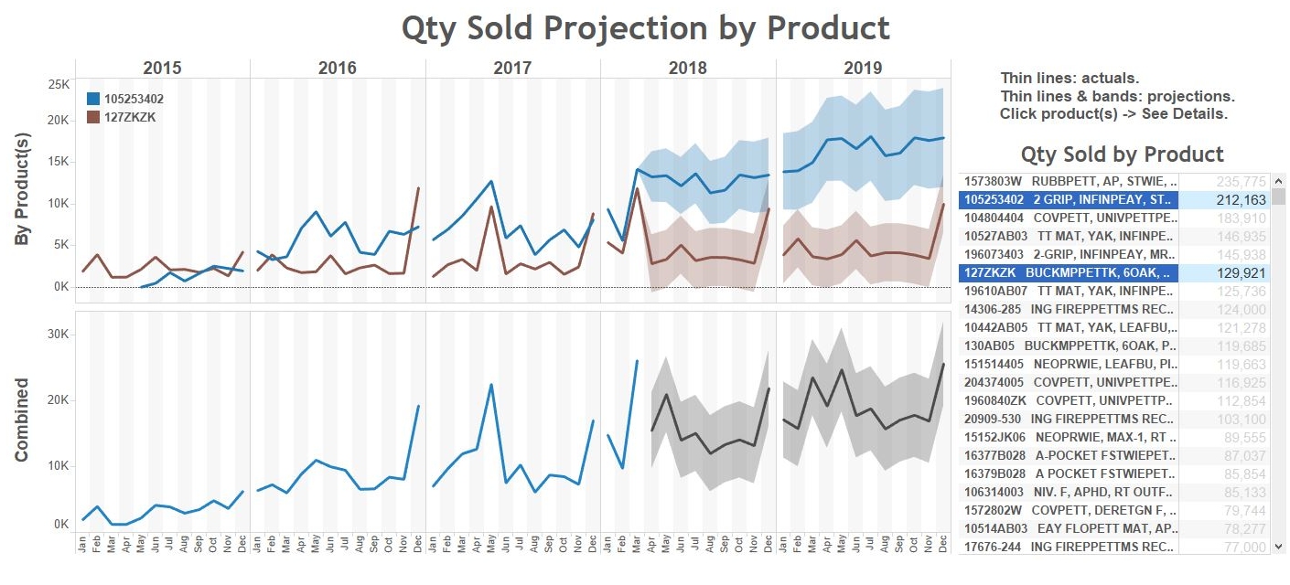
Projections
DataSelf comes with a powerful engine to assist with a variety of projections needs. The example below shows an statistical algorithm that works well for many high-volume transactions that tend to follow historical patterns. The projections can work with any metrics such as qty sold, sales, gross profit, qty on hand, or expenses.
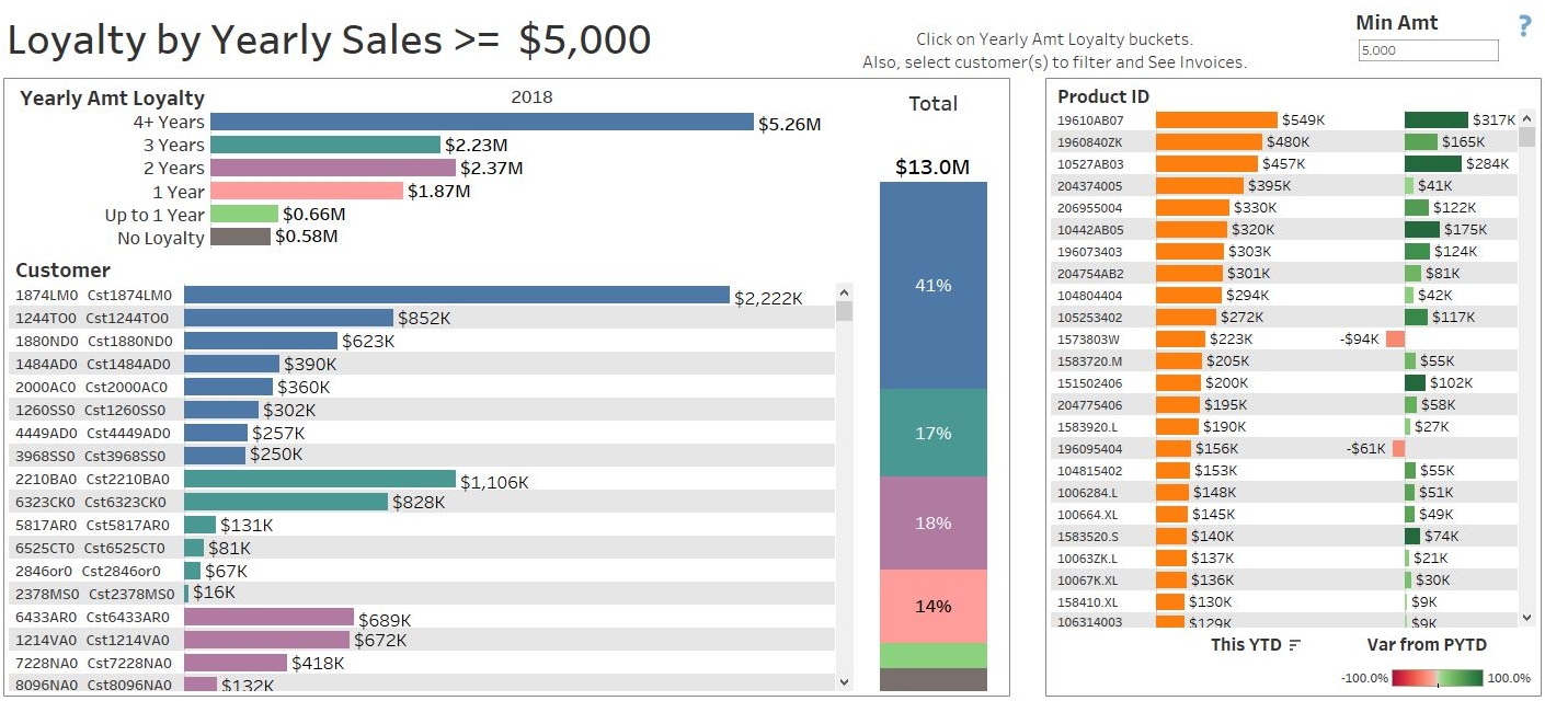
Customer Loyalty
The templates provide more than a dozen ways to analyze customer loyalty, such as by customers with a minimum yearly purchasing record, or by the customer start date (date of their first invoice). On the example below, customers with dark blue bars have consistently purchased at least $5K per year in the last 4 years.
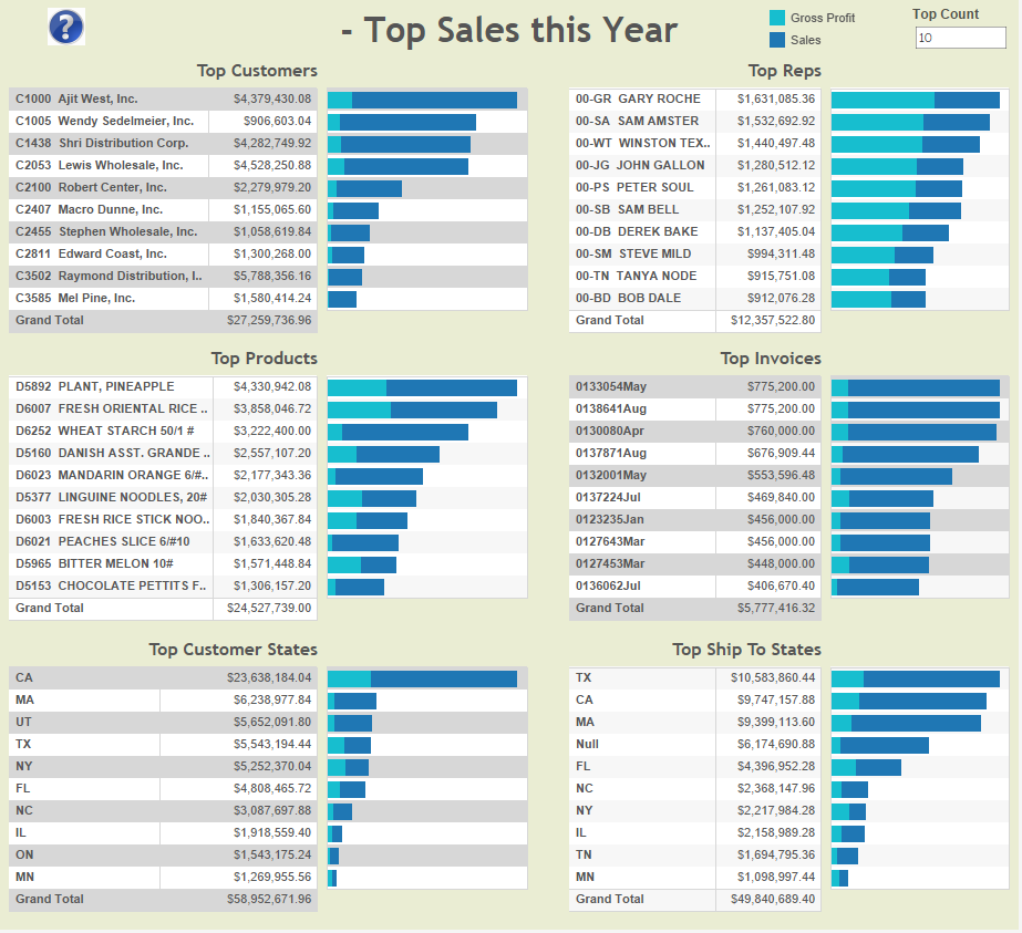
Top Performers
Shows top sales this year. We also have this for quarter and month.
360-degree View of your Business Operations
The example below shows customers with outstanding receivables (brown color indicates clients with AR past due amounts), all CRM opportunities with high probability of closing, orders to be shipped, actual sales and gross profit, all according to selected filters (in this example: this quarter and by an account manager).
Similar dashboards can show information by product, territory, account manager and other dimensions that work across the involved data sources. This dashboard is not available out-of-the-box. However, it’s easy to set it up if your organization has the data to populate it (contact us for details).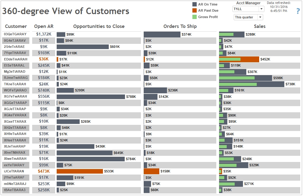
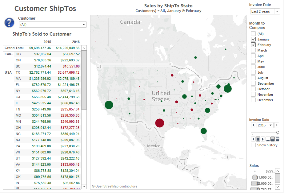
Ship To by Customer
The user searches/selects a customer from the drop down list, and query shows their sales in the same month in the last 2 years. Red colors indicate that there’s a sales decline comparing to last year. This can be helpful to address declining sales and see why certain regions are doing better than others. We have similar dashboards by product and salesperson.
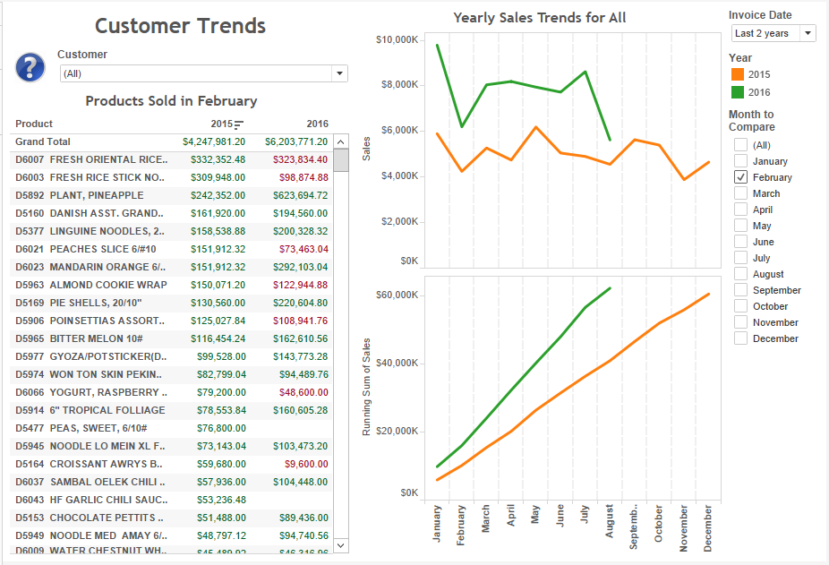
Customer Trends
Similar to the dashboard above. The rep can select a customer and:
- See sales trends by month
- See which products have declining sales from the same period last year. If the rep is in a call with the client, the rep can investigate reason for sales declines.
We have similar dashboards by product and salesperson.
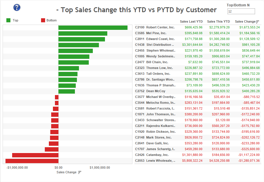
Top Sales Increase and Decrease by Customer
It shows which clients are growing the most and declining the most since last YTD (also for QTD and MTD).
We have similar dashboards by product, customer address, ship to and salesperson.
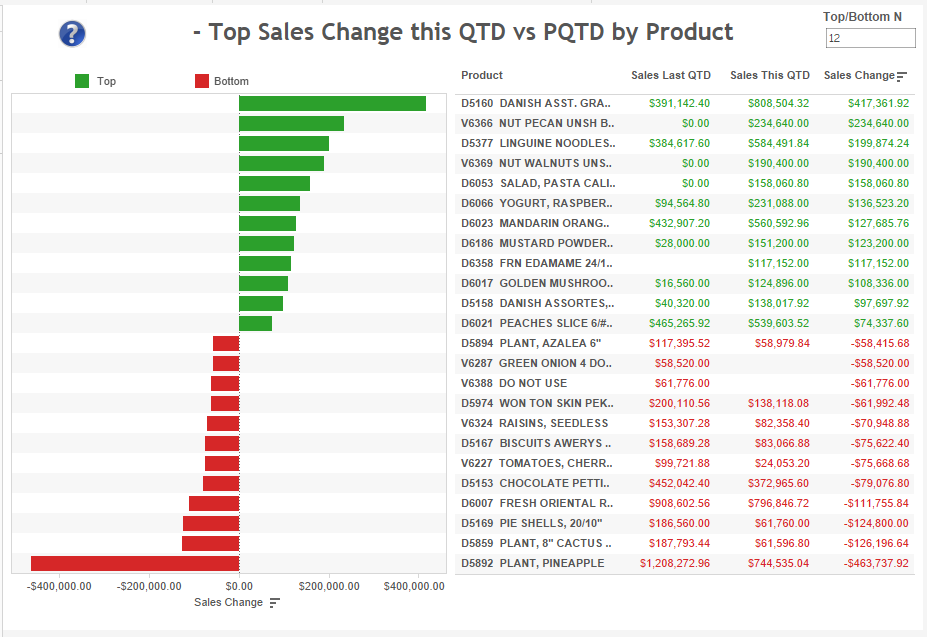
Top Sales Increase and Decrease by Product
It shows which products are growing the most and declining the most since last QTD (also for MTD and YTD).
We have similar dashboards by customer, customer address, ship to and salesperson.
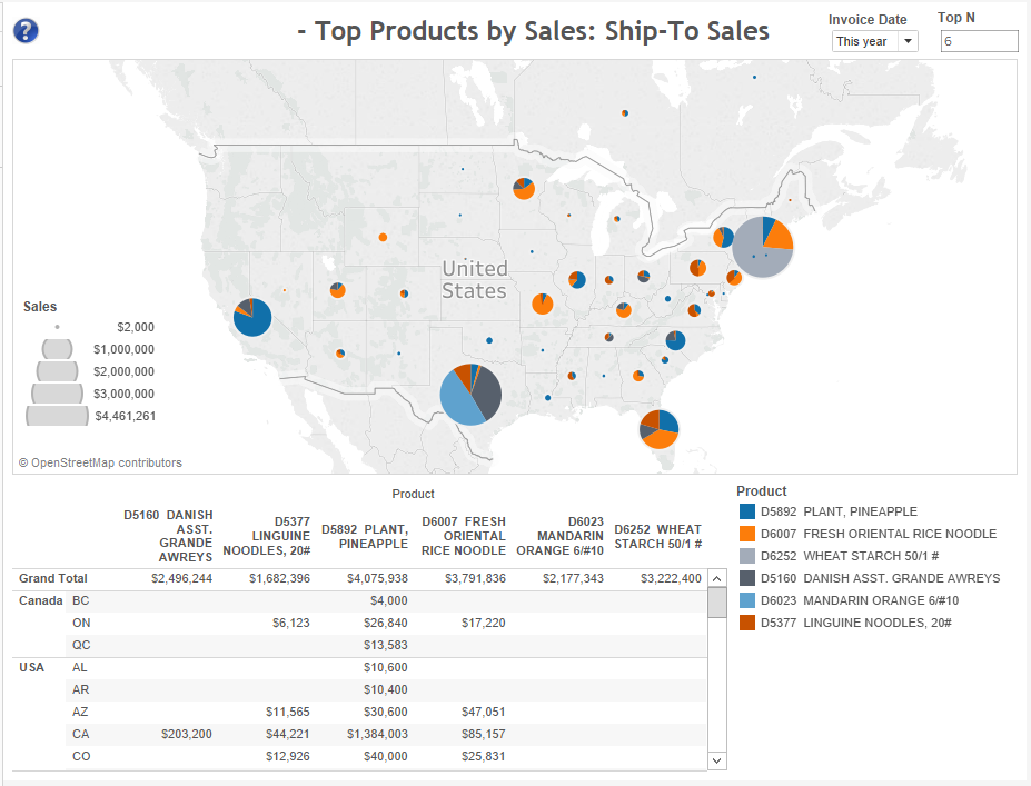
Top Products and their ShipTos
Dashboard shows top products and their sales by ShipTo. User can change number of top products, as well as what period to look at.
This can be helpful addressing logistics and shipping methods for top products.
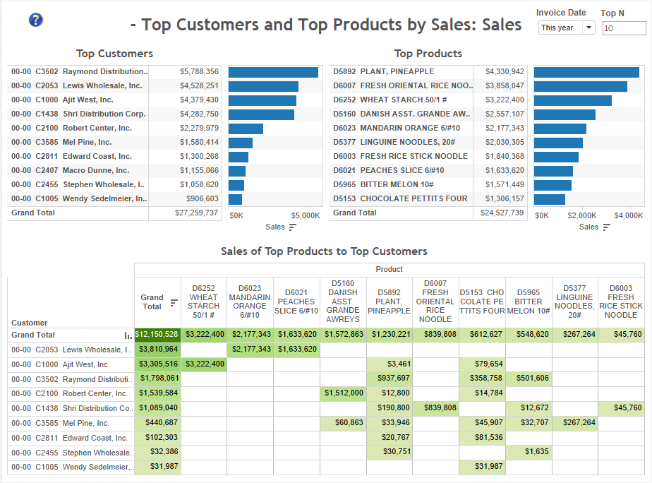
Sales of Top Products to Top Customers
Ideally, top customers should be buying lots of top products. If not, why not?
There are similar reports showing sales of top customers and top products by different dimensions such as salespeople, ship to, and cst address.
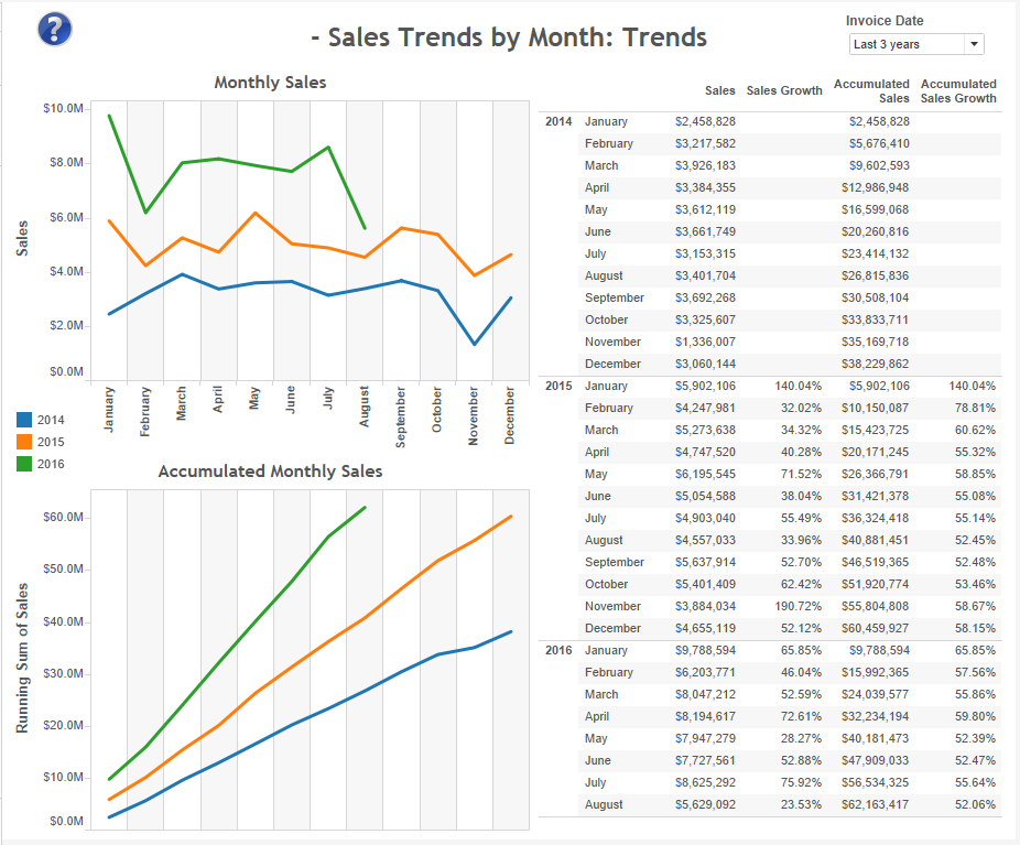
Company wide Monthly Sales Trends
Shows company wide sales trends (sales, accumulated sales, and growth). We also have this by year.
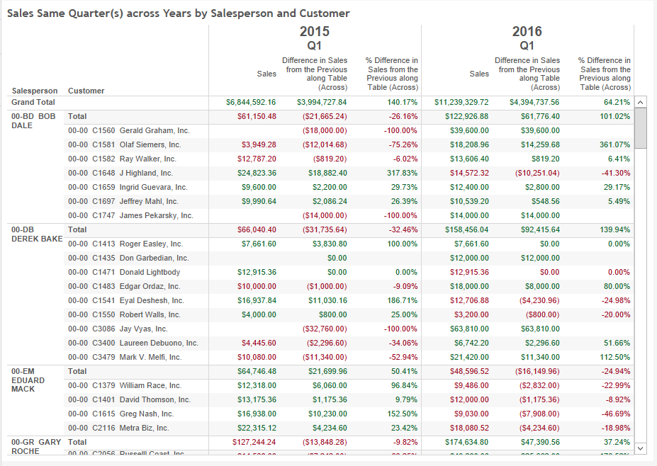
QTD Sales and Year-over-Year Sales Growth (customer focus)
A detailed report showing quarter-to-date sales this and last year by salesperson and customers (and other dimensions as well). Why some of them (red fonts) are declining? Can you do something about it? We have similar dashboards by product, customer address, ship to and salesperson (also by company in multi-company systems).
QTD Sold, Sales and Year-over-Year Sales Growth (product focus)
A detailed report showing quarter-to-date sales this and last year by product and salesperson. Why some reps are more/less successful than others pushing products out?
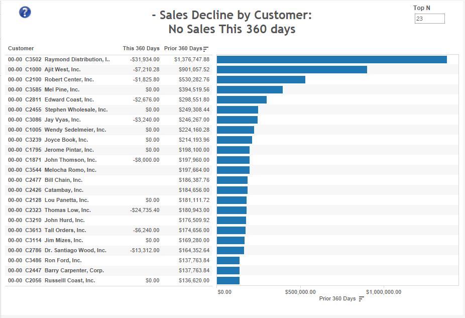
Top Sales Decline by Customer (no sales in this vs last period)
This report is usually useful to find out which major customers aren’t buying anymore (we have this for last 30, 90 and 360 days. It’s easy to change the time buckets).
We have similar dashboards by product, customer address, ship to and salesperson.
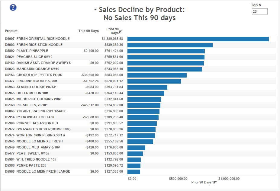
Top Sales Decline by Product (no sales in this vs last period)
This report is usually useful to find out which major selling items aren’t selling anymore (we have this for last 30, 90 and 360 days. It’s easy to change the time buckets).
We have similar dashboards by customer, customer address, ship to and salesperson.
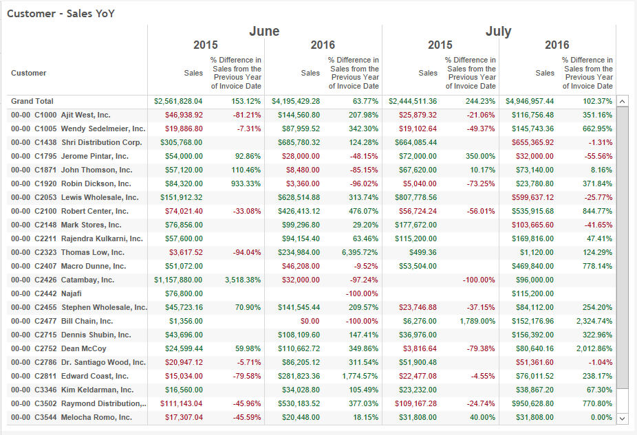
Sales Growth from the Same Period in prior Year(s) by Customer
A detailed report showing monthly sales and growth from the same period prior year(s). Amounts in red means decline from the same period in the prior year.
We have similar dashboards by product, customer address, ship to, and salesperson (also by company in multi-company systems).
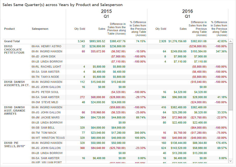
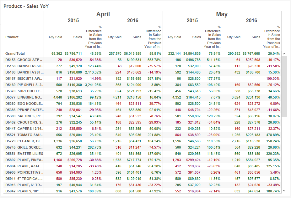
Sales Growth from the Same Period in prior Year(s) by Product
A detailed report showing monthly sales and growth from the same period prior year. Amounts in red means decline from the same period in the prior year.
We have similar dashboards by customer, customer address, ship to, and salesperson (also by company in multi-company systems).
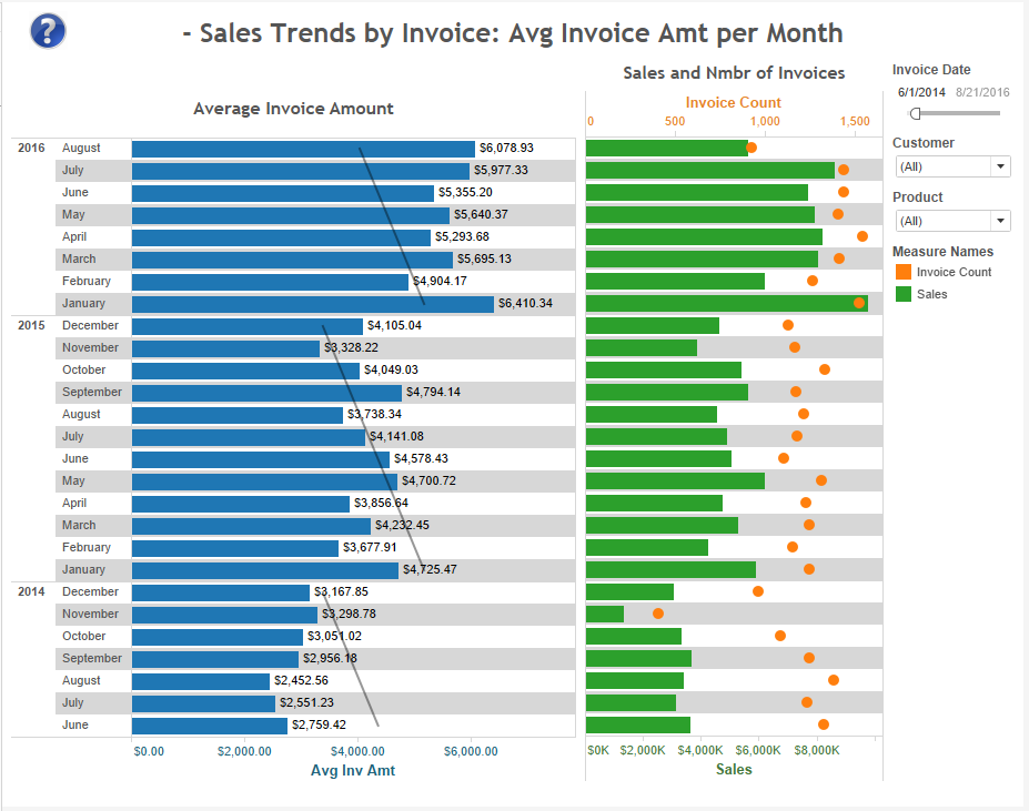
Invoice Trends
Is it important for your organization to monitor average amount per invoice, invoice count, average items per invoice, and average days between invoices? Our dashboards and reports will provide you with a great starting point.
The example below shows average invoice amount and invoice counts over time. As shown, there’s a clear pattern of average invoice amounts to decrease from Jan to Dec.
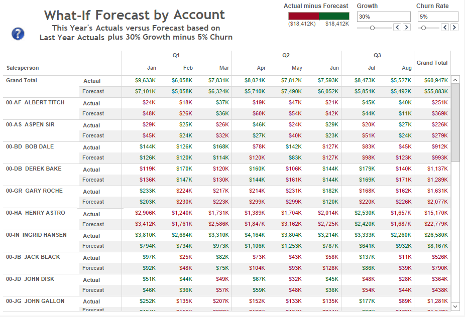
What-If Forecast
This is an example of what-if scenarios where the forecast is calculated by applying user-defined growth and churn rate to actuals from period periods. Forecast can be calculated in a variety of ways or imported from other data sources (such as Excel or dedicated forecast systems).
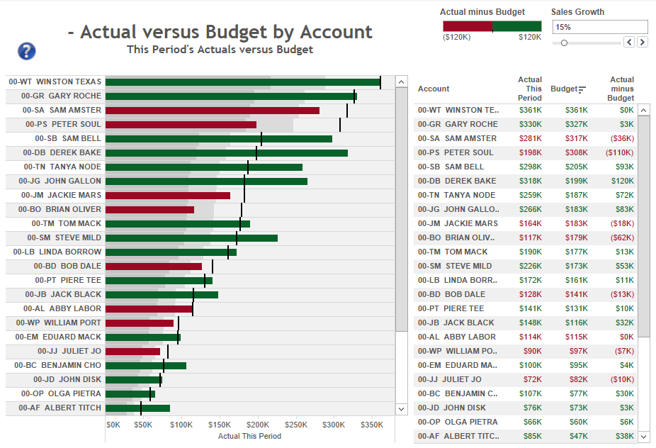
Actual versus Budget
This is an example of actual versus budget where the budget is calculated by applying a user-defined growth to actuals from period periods. Budget can be calculated in a variety of ways or imported from other data sources (such as Excel or budgeting systems).
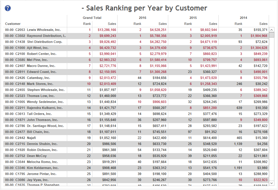
Sales Ranking by Customer
How are your most important customers ranking on a year basis? Are they going up or down on sales ranking? See example below where customer #9 from Total dropped to rank 44 in 2016.
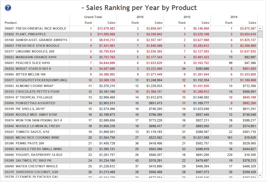
Sales Ranking by Product
How are your most important products ranking on a year basis? Are they going up or down on sales ranking? See example for customer ranking above for ideas of how this insight can be valuable.
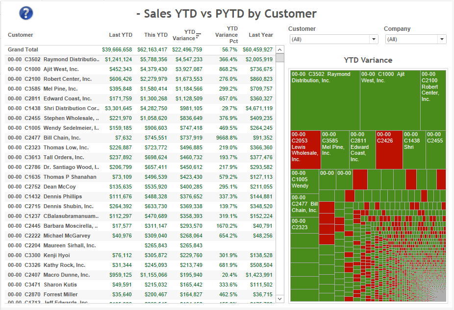
Comparison of YTD vs PYTD Sales by Customer
A report showing customer sales this YTD, prior YTD, YTD variances and full last year. The cart quickly shows box sizes based on YTD variance, and color based on growth/decline.
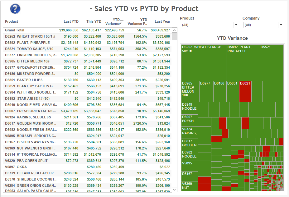
Comparison of YTD vs PYTD Sales by Product
A report showing product sales this YTD, prior YTD, YTD variances and full last year. The cart quickly shows box sizes based on YTD variance, and color based on growth/decline.
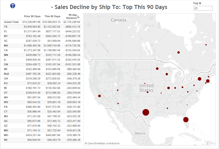
Sales Decline this 90 days by ShipTo
If ShipTo is critical, this dashboard shows sales variances this 90 days (it’s easy to change the time buckets). You can see the data across all sales or filter it by customer and/or product.
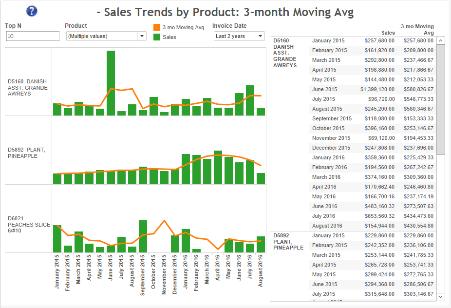
Moving Averages
Is it important to monitor moving averages? Dashboards like the one below will help you monitor moving averages in different parts of your business. It’s easy to change the period included in the report as well as the period to calculate the moving average (such as avg among 3, 6 and 12 months).
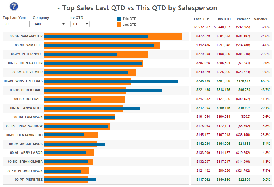
Top Sales Last QTD vs This QTD
This allows the monitoring of how top performers in the last QTD are doing in this QTD. Ideally, they are doing better now. These dashboards cover dimensions such as Salesperson, Customer, Product and ShipTo.
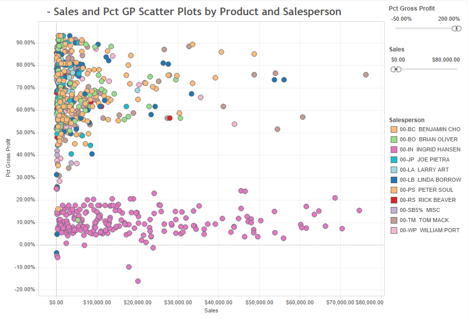
Sales and Gross Profit Scatter Plots
These dashboards can show outliers or trends that might not be so obvious. In the example shown here, Salesperson=Ingrid has a profitability way below than everyone else.
![]()
DataSelf provides plug-and-play templates for the following ERP systems:
– Acumatica
– Everest
– MS Dynamics 365
– MS Dynamics AX
– MS Dynamics GP
– MS Dynamics NAV
– MS Dynamics SL
– NetSuite
– Sage 100
– Sage 300
– Sage 500
– Sage Pro
– Sage X3
Contact us to discuss other ERP systems.
Call 888-910-9802 x1 or email Sales @ DataSelf.com