Einstein once said, “If you can’t explain it simply, you don’t understand it well enough.” This is as true for building data visualizations as it is for anything else!
You need to explain your data as simply as possible.
Use Easily Understood Visualization Types
Not all your users will be data savvy. If you use a scatter plot, are you prepared to teach that user how to read that kind of chart? Or, is there a better way to present the same data to that user?
From my own experience, and from talking with many data experts over the years, I can tell you that it’s much better to use visualizations that are easy to understand at a glance. The following are some of the most popular, simplest types of plots and charts you can use:
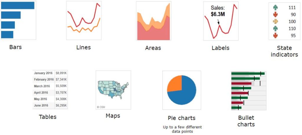
Users can glance at these charts and quickly understand what you’re trying to say. Bars, lines, areas, labels, state indicators and maps are easy to understand to most people. Some people aren’t fans of tables on dashboards, but for certain types of analysis, they are the perfect choice. Pie charts are also controversial, but when showing only two or three data points, they can clearly convey a message. Finally, bullet charts use real estate very well for things like actuals versus budgets and goals.
Choose the best visualization that presents your data in a clean, simple, and uncluttered way.
Formatting Numbers
Another great way to present your data is by formatting numbers and dates in a way that appeals to the pre-attentive brain.
Here is an example of a poorly formatted table of data:
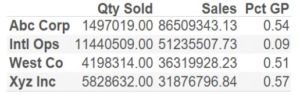
As you can see it’s hard to read, not formatted well, and it doesn’t tell the message very clearly.
Look at the same table formatted a little differently:
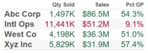
Making a few small changes makes a big difference. Things like:
- Showing numbers in thousands (K) or millions (M).
- Showing percentages.
- Adding colors to show threshold.
The idea is to save on real estate, and focus on the message.
Formatting Dates
Date is a very common dimension in visualizations. Using proper date formatting can save screen real estate and get your story told in an elegant and simple way.
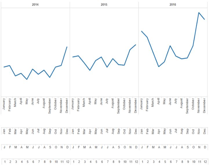
For instance, the chart below shows four types of labels for months. If a dashboard will be rarely seen and/or real estate has availability, using the full or shortened month names can work really well. On the other hand, if the same users will be looking at the chart often, you might be able to use the month number or the first letter and that’ll do the job.
Below is the same chart above, but sliced in three different rows. The top row is focused on showing yearly sales trends. The 2nd and 3rd ones use the same color bands to define the months, and the colors to define the years. The 2nd row focuses on a quick comparison how the metric compares across the years for each month. And the 3rd row gives detailed information about each month. Notice how the use of colors, bands and legends make this chart significantly more insightful than the plain one above.
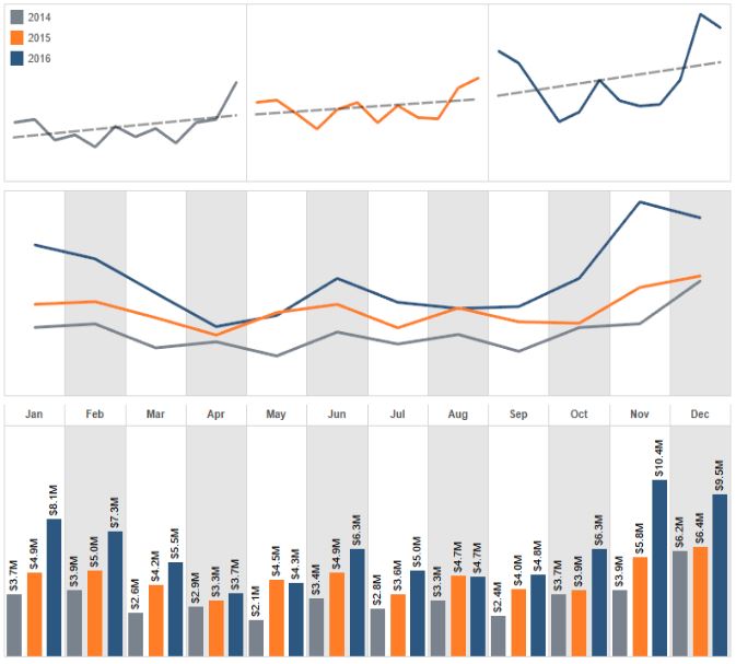
As you experiment with different formats, eventually you’ll learn what works and what doesn’t. Using techniques like these, you can fit more insights in less real estate, but still keep the visualizations clean and elegant. Users could even print this page and show years-worth of data in just a very small space!
To read more about telling your data story using dashboards, read our entire blog series by clicking on the topic below.
Introduction to Dashboards, How to Use Color, Chart Types and Formatting, Experimenting with Dashboards, Visualizations to Avoid, Layout